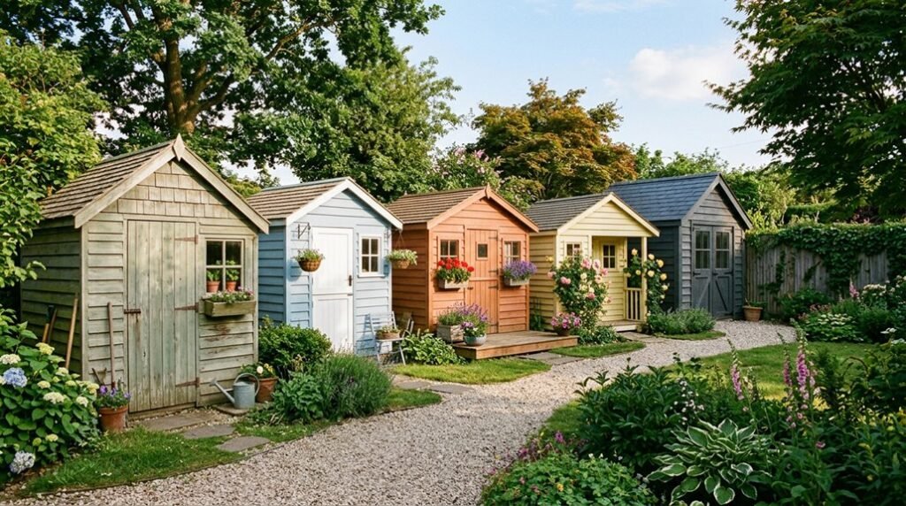
Most homeowners overlook how a shed’s paint color affects perceived garden depth: darker hues recede visually, expanding cramped plots, while pale tones advance, shrinking boundaries. I’ve seen this optical trick work in London courtyards and Midwest backyards alike.
Your shed isn’t just storage; it’s architecture hiding in plain sight. Here’s how to use color deliberately.
Match Your Shed to Your Garden: Greens, Blues, and Fence Coordination
Why blend when you can harmonize? I’m sharing my favorite garden shed paint ideas for creating that seamless connection we all crave in our outdoor spaces.
1. Embrace Nature’s Palette
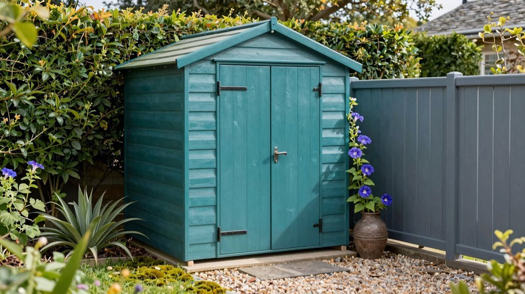
Greens and blues anchor your exterior shed to the landscape. I’ve found deep forest greens particularly effective at concealing structure among mature plantings.
Deep forest greens don’t just paint a shed—they dissolve it into the living landscape itself.
2. Master Fence Coordination
Matching your shed color to boundary fencing creates architectural continuity; you’re extending the garden’s “walls” rather than introducing visual interruption.
3. Explore Two-Tone Sophistication
Combining body color with contrasting trim color, sage walls with cream detailing, perhaps, adds dimensional interest without sacrificing cohesion.
4. Know Your Shed’s Purpose
For focal-point sheds, I’d adjust strategy; these demand distinction. But when you want to blend into surroundings, fence coordination remains paramount.
Your garden becomes more welcoming when every element feels intentional, like you belong there.
Paint Your Shed to Stand Out: Bold Colors and Smart Contrasts

How do you turn a utilitarian structure into the centerpiece your landscape deserves? I paint my garden shed in bold colors that demand attention, finishing the exterior in vibrant orange against my deep blue house, or layering a sophisticated black-on-black scheme with a contrasting scarlet door.
I recommend two-tone treatments: body plus trim, perhaps with an accent color on architectural features. Testing outdoor paint in natural light proves essential; colors read lighter outside, so I select two to three shades deeper than my initial impulse.
For durability alongside visual impact, I choose specialist outdoor wood paints formulated for weather resistance. I extend the bold palette through coordinating furniture and borders, creating cohesive energy throughout my outdoor space. A high-contrast door turns utilitarian storage into deliberate design; my shed becomes the conversation piece neighbors remember.
Go Dark: Deep Shed Colors That Hide Boundaries and Fences
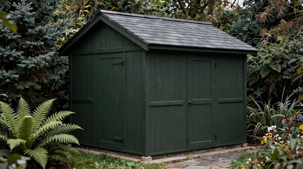
Where should the eye travel when boundaries dissolve? I find myself drawn to deep shed colors that quietly merge structure with landscape, creating sanctuary rather than statement.
A dark color shed, painted in boundary-softening tones, lets fences fade into shadow. I’ve watched a shed with dark paint disappear against evening hedgerows, its presence felt rather than declared.
Consider this range of dark colours for your retreat:
- Midnight Absorption — A dark blue-black shed swallows light, merging with twilight skies. I’ve noted how Farrow & Ball’s Black Blue erases edges between built form and garden, particularly at dusk in rural Cotswolds gardens.
- Canopy Camouflage — Forest green shed surfaces mirror surrounding foliage. This hides boundaries while rooting your structure in place, observed in moss-heavy Scottish Highlands where structures become understory.
- Shadow Continuity — Deep charcoal unifies mismatched fencing. Your hide fences strategy works when adjacent surfaces share tonal weight, creating spatial flow rather than visual interruption.
- Intentional Accent — Select a complementary door color, terracotta against slate or brass against ebony, introducing warmth without sacrificing the boundary-softening effect you’ve established.
Light Shed Paint Colors: Why Pale Shades Need Darker Tints Outdoors

What happens when a cherished interior white meets full sun? It vanishes, bleached into near-invisibility by harsh outdoor lighting. I’ve learned outdoor pale colours demand strategy, not wishful thinking.
Here’s what experience teaches about exterior paints:
| Exterior Colour | Recommended Adjustment | Result |
|---|---|---|
| Soft ivory | Two shades darker | Warm, defined façade |
| Delicate rose | Three shades deeper | Romantic, sun-stable tone |
| Powder blue | Deepened tint | Coastal charm without washout |
Always test outside; your shed door deserves precision. That romantic pale shade I chose for Wenche’s shed? I went three steps darker than the swatch suggested. Exterior paints change under open sky.
For real visual impact, anchor outdoor pale colours with contrasting elements: a vivid terracotta door, perhaps, or white rose climbers framing the structure. Without darker tints, your sanctuary risks becoming a sun-bleached ghost.
Coordinate Everything: Matching Gates, Bins, and Water Butts to Your Shed
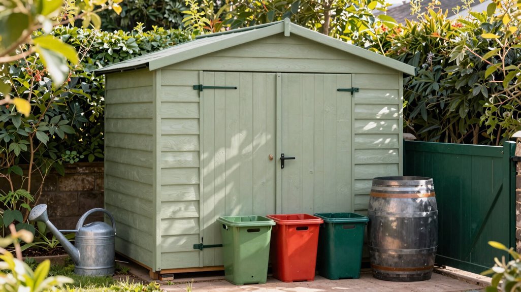
Why stop at the shed walls when the surrounding garden infrastructure offers such opportunity for cohesion? I’ve learned that true exterior coordination transforms scattered elements into a unified sanctuary, where matching gates, water butt color, and bin store color speak the same visual language as your garden shed paint.
Testing shade swatches outdoors at different times reveals how natural light shifts your chosen coordinate color across surfaces. When I painted my water butt and bin store Farrow & Ball Black Blue, matching my shed’s facade, the garden shed paint scheme created instant architectural harmony. For those craving contrast, a complementary shade on doors maintains visual balance without sacrificing the cohesive aesthetic.
Testing shade swatches outdoors at different times reveals how natural light shifts your chosen coordinate color across surfaces.
- Paint everything identical: shed, gates, water butt, and bin store share one hue for maximum unity
- Test swatches at dawn and dusk: ensuring your cohesive garden reads consistently
- Revise mismatched elements: that white back gate and green water butt deserve integration
- Balance bold accents: keep foundations neutral, letting trim provide punctuation